
Citadelles & Mazenod
Review by David Starkey
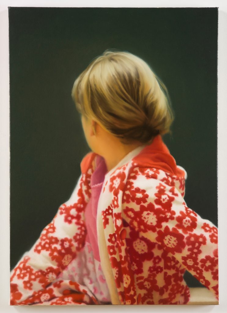
Honestly, I’m not sure what to make of Gerhard Richter. Like anyone who has visited art museums over the years, I’ve seen plenty of his work. There are the many oil paintings that look like photographs—some sightly blurred, others very much so—the squeegeed abstractions, the thin lines of color running horizontally across the canvas, vibrating with a weird intensity. But for me, something significant often seems to be missing, even if that absence is clearly the point. Still, I always linger a little longer, trying to figure out whether I like what I’m seeing. Yes? No? Maybe? All of the Above?
I had that experience once again when I visited the recent Richter retrospective in Paris at the Frank Gehry-designed Fondation Louis Vuitton. Located on the northern edge of the Bois de Boulogne, the FLV, as it likes to style itself, radiates wealth, and perhaps that affected my viewing of Richter’s work. I was both awed by its sheer volume and scale, and slightly put off by the sense that I was in a temple devoted as much to commerce as to art.
Still, it would be wrong to say that the FLV’s 10 by 12-inch catalog of the exhibition, published by Citadelles & Mazenod, is anything but beautiful. The paper is thick, the colors are vivid, and, unless I’m mistaken, images of every last piece in the exhibition can also be found in the book. If one misses the impact of enormous, multi-room works like the 65-foot-long Stroke (on Red), it’s awful handy to be able to flip through the pages and zoom from one decade to the next, looking at how Richert’s work has changed, and how often he’s revisited earlier ideas.
Because it is so varied, Richter’s art can be difficult to describe, but editors Dieter Schwarz and Nicholas Serota are on to something important in their introduction. Examining a group of “unspectacular little paintings… [taken] from the common world,” they point out that the viewer has “no way of understanding what the context is,” and “there is no apparent reason to select and frame” whatever is being painted. “The subject is often melancholic, it is dull, it is gray, but nevertheless arresting.”
That last phrase—“nevertheless arresting”—could be used to describe a great deal of Richter’s work. In the 1960s, he painted what look like blurry snapshots of unlikely subjects (a roll of toilet paper is especially ironic). In the 1970s, his work becomes more abstract, with his use of the squeegee become almost as iconic as the dribbles and splashes of Jackson Pollack’s action painting. In the 1980s, his work was both abstract and representational, with his lovely 1988 portrait of his daughter, Betty, being justly renowned.
Later, there were the “strip” paintings of colored lines, a series of charming abstract watercolors, odd little pencil drawings of tram cars and squiggly uncertain figures, and glass and steel sculptures. This is an artist who is not afraid to try his hand at just about anything.
For those wanting to learn more about Richter’s philosophy and processes, there’s a lot of text accompanying the art, much of it rather abstruse. Here’s just a sample, a sentence from Florian Klinger’s essay on the Birkenau paintings: “We can now also say how the indeterminacy of Richter’s paintings, by declaring erasure and presentation as not external to each other, contributes to the project of the mnemonic recovery: the indeterminacy ensures that the abstraction does not relate to the referential import it carries as something different from itself (as would be the case in a dialectic relationship), but that it is this import.” Okay. However, even when the contributors get caught up in their own words, they nearly always have something valuable to impart.
So, is Richter a full-on genius, or just indefatigable in his art-making? I’ll leave the answer to that question to readers of Gerhard Richter. For my money, it’s still: Yes. No. Maybe. All of the above.